
Waterfalls in Tableau
Without any Blending or Advanced Dashboard Techniques

Too lazy to read all of this? I get it, check out the 6-minute video on how to do this on my YouTube Channel.
When I first got started with Tableau, it was like love at first sight. It was easy to use, looked great, and it looked like I had discovered fire for the first time when I showed off my content to co-workers.
However, this luster quickly wore off once I stepped a layer deeper. Seemingly simple charts in Excel were ten times harder in Tableau. Conditional formatting was one example of this phenomenon. Waterfall charts were the other.
Anyone who has had to build one of these bastards knows exactly what the hell I’m talking about. But your days of cold sweat on your palms over this problem are now over.
Here is my solution to the dilemma. No fancy tricks, no data blending, no multiple sheet dashboards to recreate one chart. Just a simple, single sheet.

The Data
The data is not complicated either, it’s just a simple flat table of daily sales from 2021-2023 for a fictional brewery called Brew & Bites that I generated on my own. It even has its own logo

Here are the highlights:
Dimensions (Dims): Date, Weather, Beer
Metrics: Sales, Units, Price, Discount
Boolean: 1 if there was a promotion that day and for that beer, 0 if not
Suffixes: AC (Actuals), FC (Forecast), BU (Budget)

Virtually every business in the world will have this data or can get after this data.
A Quick Note on the Metrics
You’ll notice that I am using Target Sales (TGT Sales), This Year Sales (TY Sales), Units, Price, and Mix. I wrote a post on exactly how to do this that you can find here.
Creating the Labels
The biggest challenge to waterfalls is handling the dimensions. How do you condense all this flat data into variances without screwing everything up?
To solve this problem we’re basically going to trick Tableau using density:

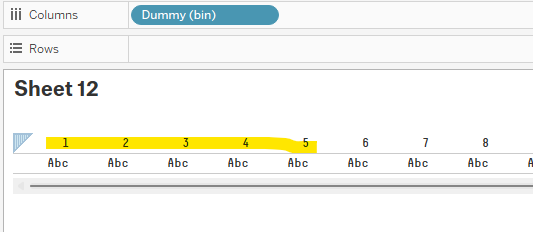
This formula simply returns the day of the month when given the date in our data set. We call it “Dummy” because it’s just creating a series of numbers we are going to use later on.
Next, we create bins of the Dummy, and tell Tableau to create bins with a step size of one:

Boom, now we have an index with enough values for the number of labels we will need (Target Sales, Price, Units, Mix, This Year Sales).
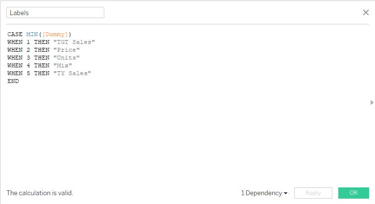
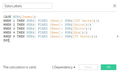
To create the text that will be shown on the axis, we will use a CASE statement:
Throw Labels into Columns, the Dummy (bin) into detail, and select Gantt Bar for the marks. You’re going to get a null for labels because we only defined numbers 1-5. We’ll just exclude those using a filter.
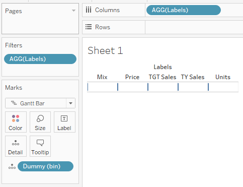
Then, we manually sort the labels in a way that makes sense. After all, our visuals should make sense.
The order doesn’t really matter as long as you keep it consistent from here on out.

Calculate the Starting Point
This is the hardest part since we have to tell Tableau where to start each level of the waterfall. Once you do it though it starts to make sense pretty quickly.
You’ll also notice I am using a Level of Detail (LOD) calculation to do this. If you are using any sort of dimensions (like category) in your data, you’ll need to do these calculations at the relevant level of detail. In this case, we are calculating everything by the Beer.
LODs can get hairy and extend load times the larger and more granular the data is that you are using. I recommend prepping your data and only including what you need to get the job done if you’re going to do this.
Again, we use a CASE Statement
The first Label (TGT Sales) will start at zero
The next step (Price) needs to start where Target Sales leaves off
The next step (Units) needs to start where Target Sales are after the impact of price
and so on until you get this…

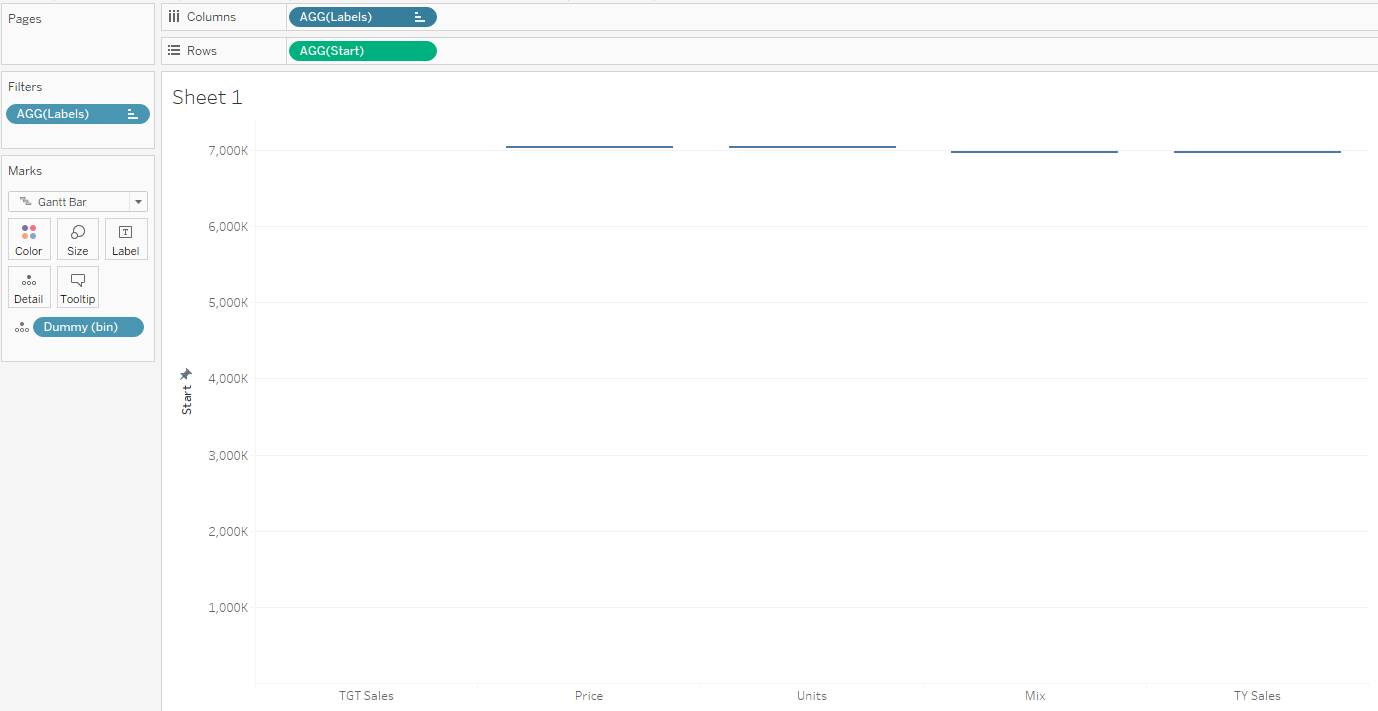
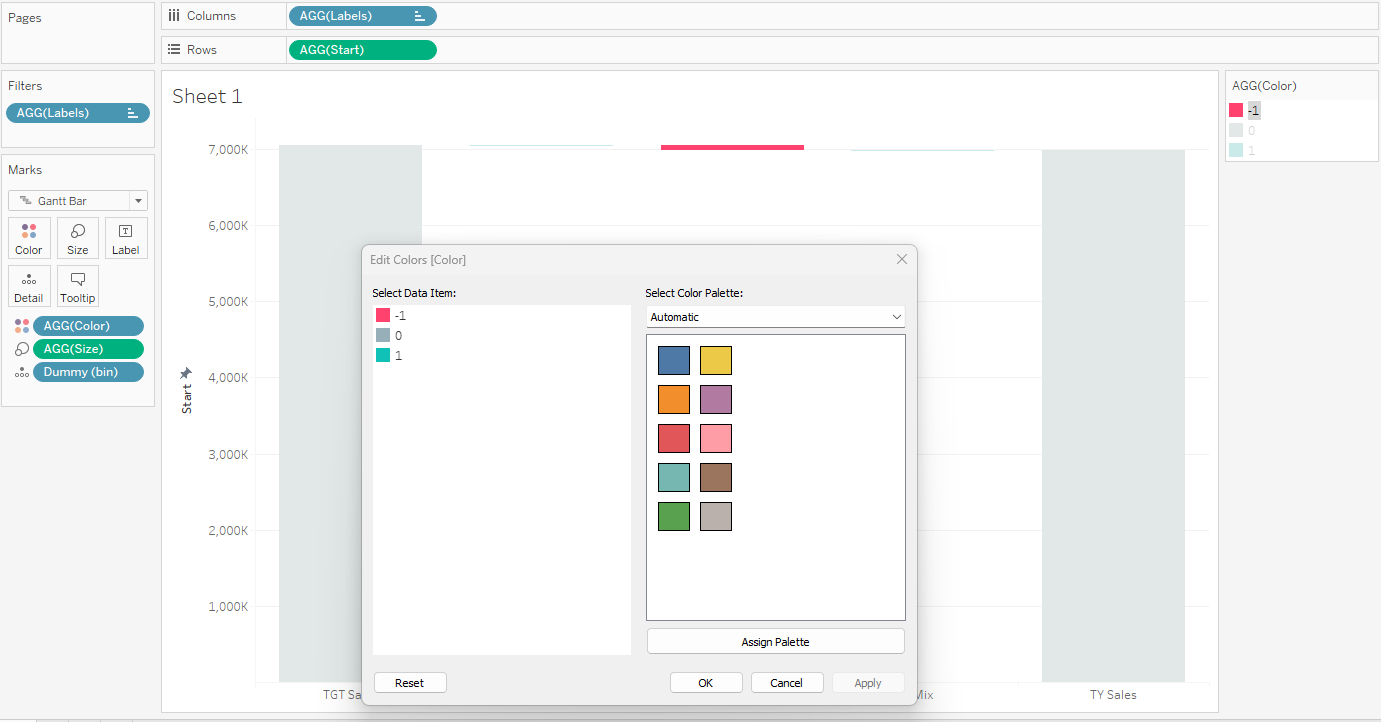
Drag Start onto rows, and you’ll get something that looks like this:
Just a quick note here: I don’t like all the wasted white space because of how small the variances are compared to the two bookends. This is an overall gripe I have with waterfall charts in general. It’s just difficult to compare the variance from Price to the variance of units / mix.
One way to overcome this is to scale the numbers between 0 and 1. Since we are going to hide the axis anyway, its scale does not matter all that much. Here again, though is a shortcoming of this kind of chart. You need to butcher the scale of the y-axis to force it to tell the story you want it to tell.
Calculate the Bars
Next, we fill in the size of the bars using similar logic as the starting point. Note that now we are using the actual metrics themselves. Also, since our ending point has to start vertically, we need to fill in the bar using a negative. Go ahead, try not to use the negative, I dare you.

Drag Size to Size and now we’re cooking with gas.

Color the Bars
For the colors, we use a discrete formula called “Color” that will return 0 for the bookends, a +1 for positive variances, and -1 for negative variances:

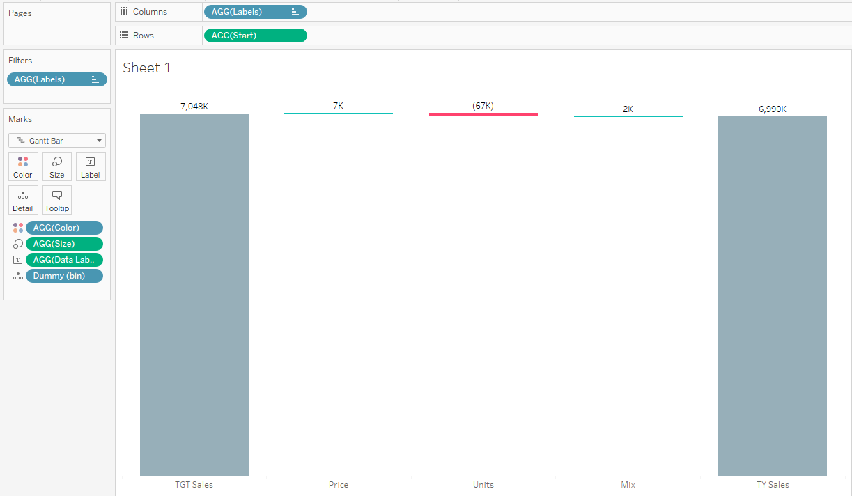
Add in the Data Labels and Clean up the Formatting
Our final calculated field is to actually label the bars. Drag that sucker onto labels, clean up the formatting, and abra-fucking-cadabra we gotta warrant, er- I mean waterfall chart.
And That’s It
I’ve seen a ton of waterfall solutions in Tableau, but none that allow you to do things in a singular view. I still am not the biggest fan of this kind of visual, but it certainly has its place in the lexicon of visualizations.